Gate VIP Redesign
Apr 2026
Gate is a global digital asset exchange. This project focuses on the VIP business pages, improving the tier system, benefits communication, and upgrade path for high-value users.
Background
Gate is a global digital asset exchange covering spot, futures, earn products, Web3 wallet, and other crypto asset services. As an exchange product, Gate serves a broad range of users from regular traders to high-net-worth VIP users, so the design needs to balance trust, efficiency, information density, and asset security.
This project focuses on the VIP business pages, improving the tier system, benefits communication, and upgrade path to make the experience clearer and more identity-driven for high-value users.
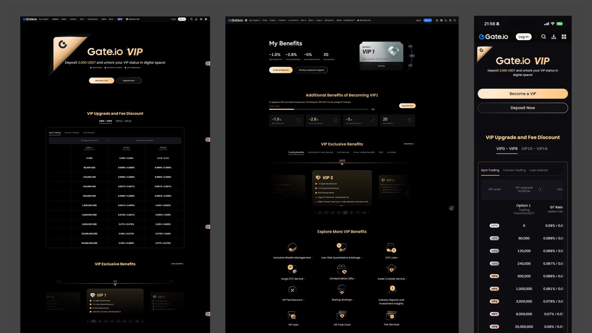
Before
Before the redesign, the Gate VIP page felt too dark and empty, with limited visual hierarchy and premium quality. The black-gold style was generic, the upgrade path was not prominent enough, and the card, button, icon, and table modules lacked consistency, weakening the refinement expected from a VIP page.
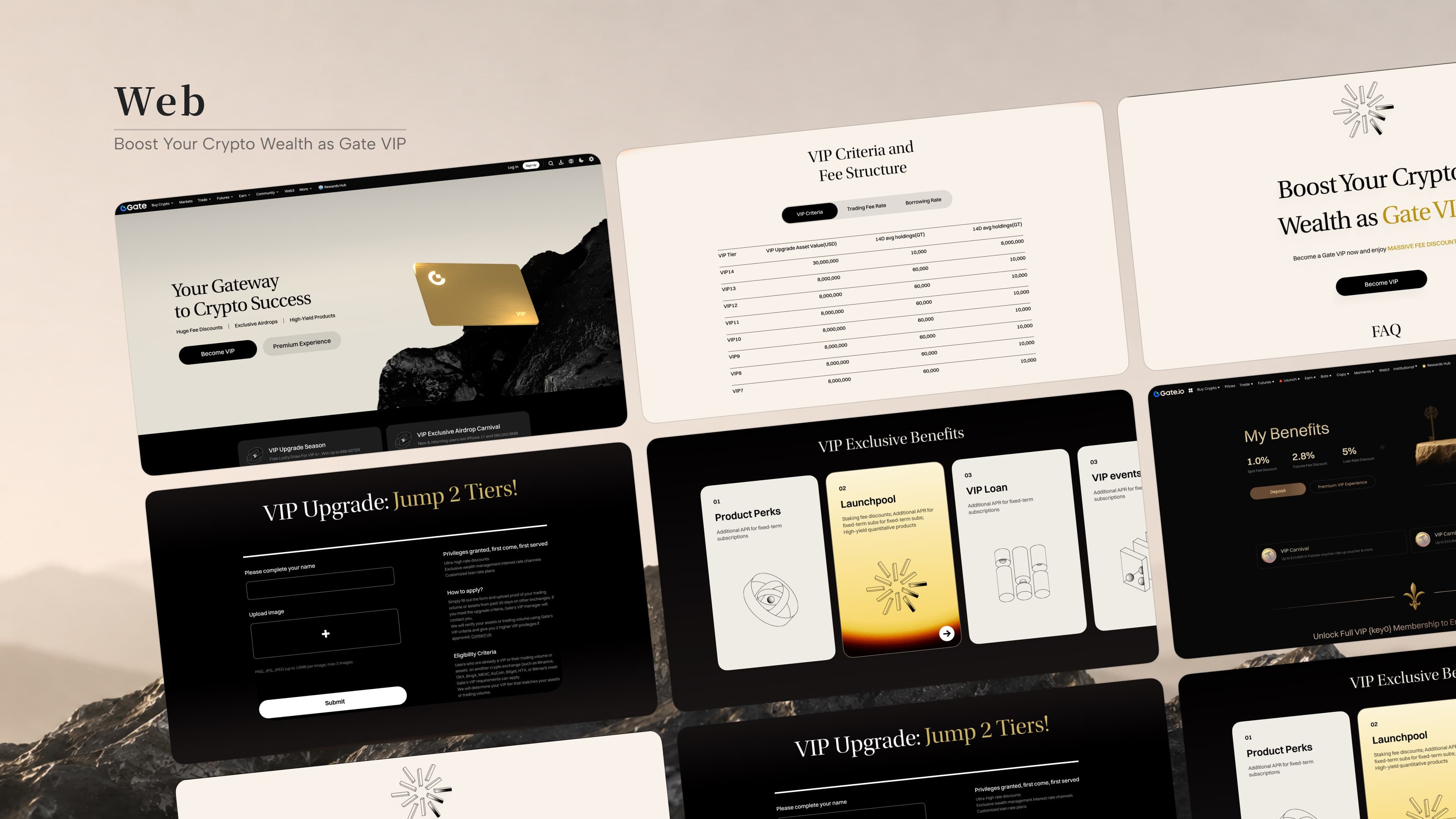
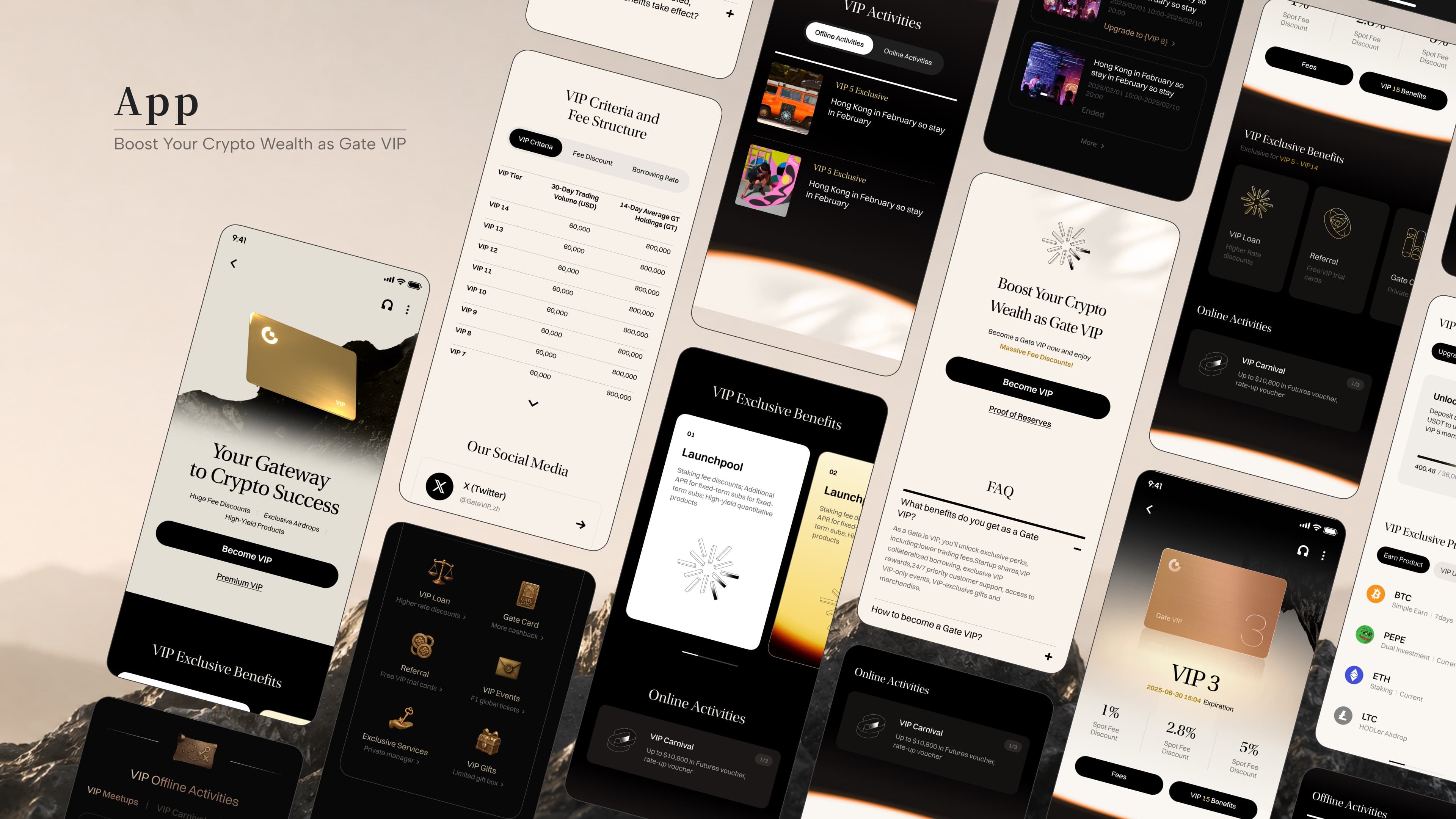
Redesign 5.1
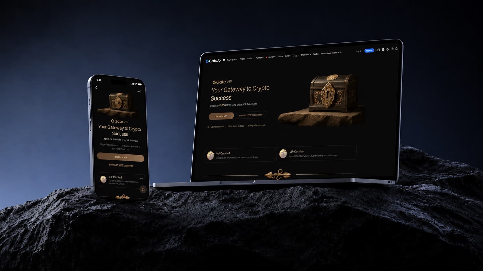
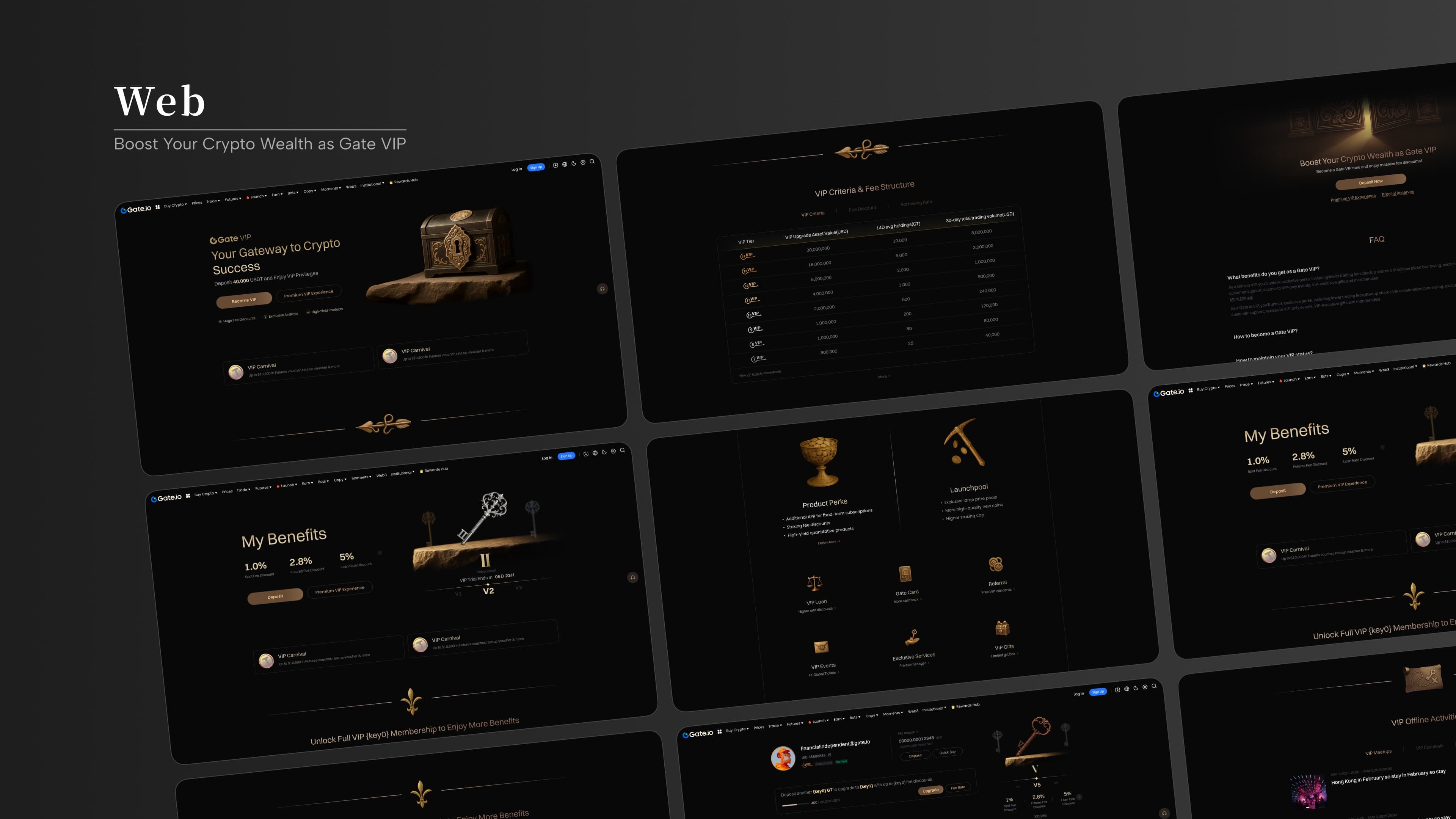
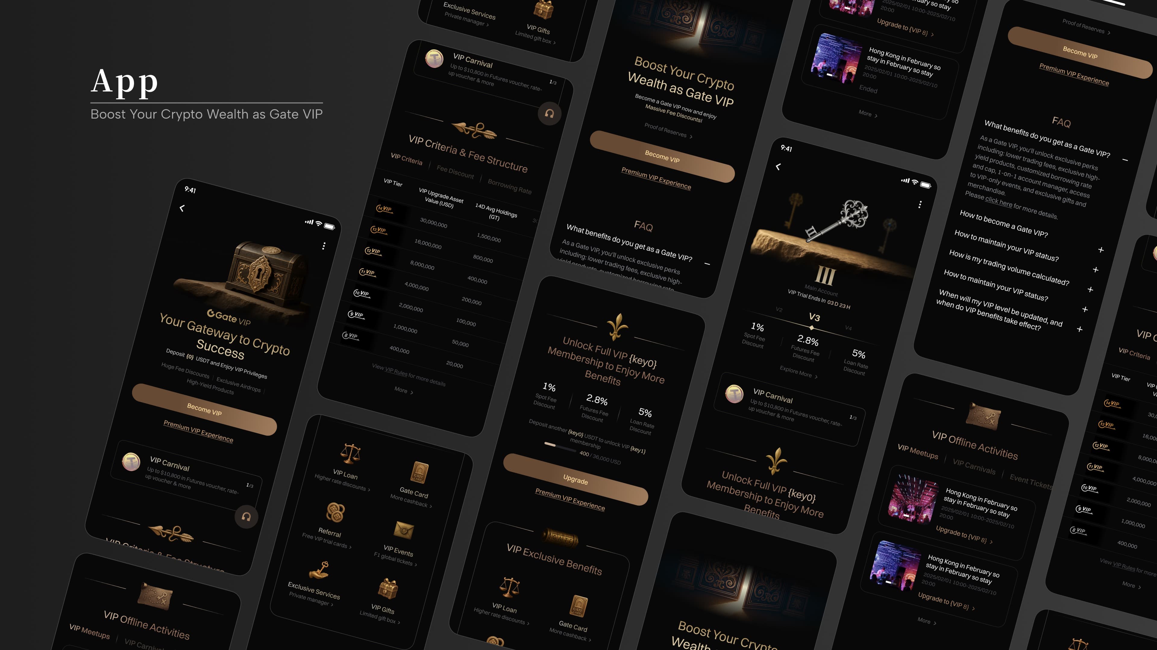
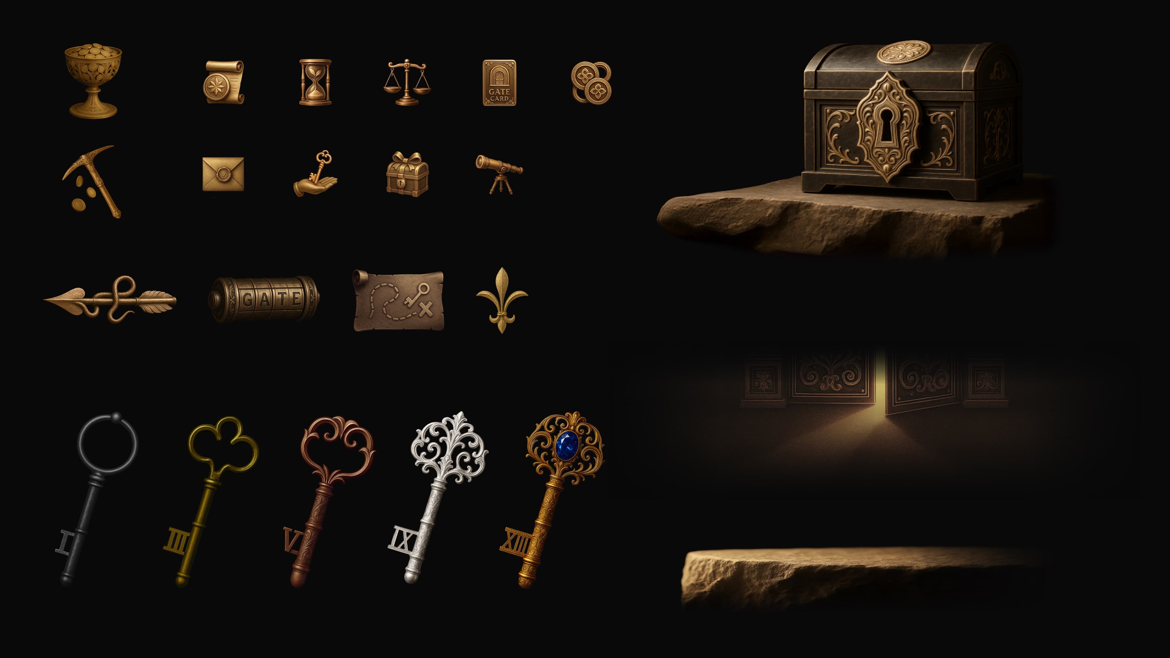
The first VIP redesign aimed to move the experience from functional delivery to a stronger sense of exclusivity. The visual direction introduced a medieval European noble aesthetic, using classical high-quality language to give a modern financial interface a more distinctive identity.
The work refreshed the VIP landing page and reset key business modules such as downgrade retention and fee calculation, using a more immersive premium experience to support conversion and retention for high-value users.
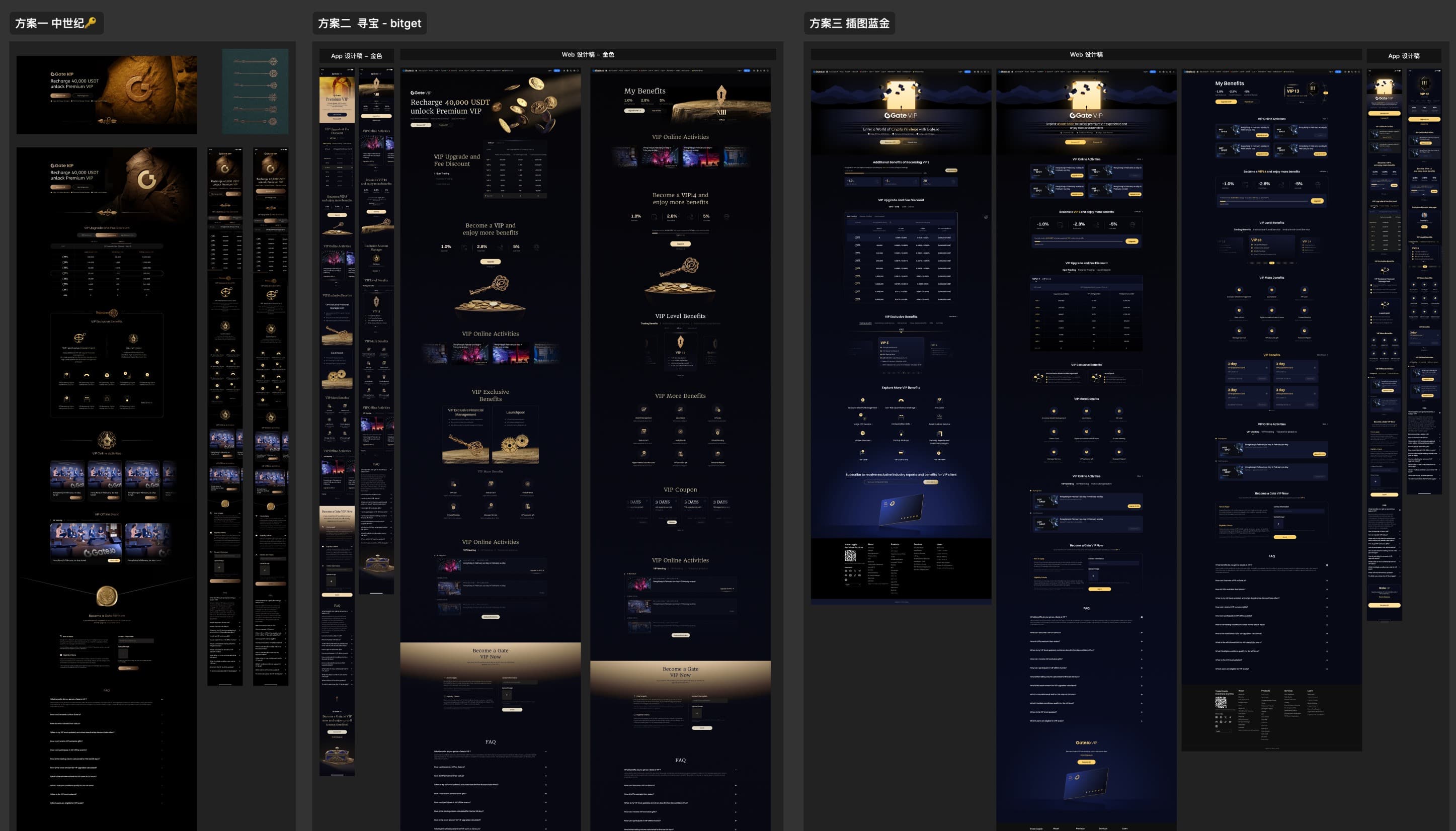
Visual Language
The selected direction was refined around a medieval noble aesthetic, designed specifically for VIP users: council rooms, power, privacy, status, and ornate detail.
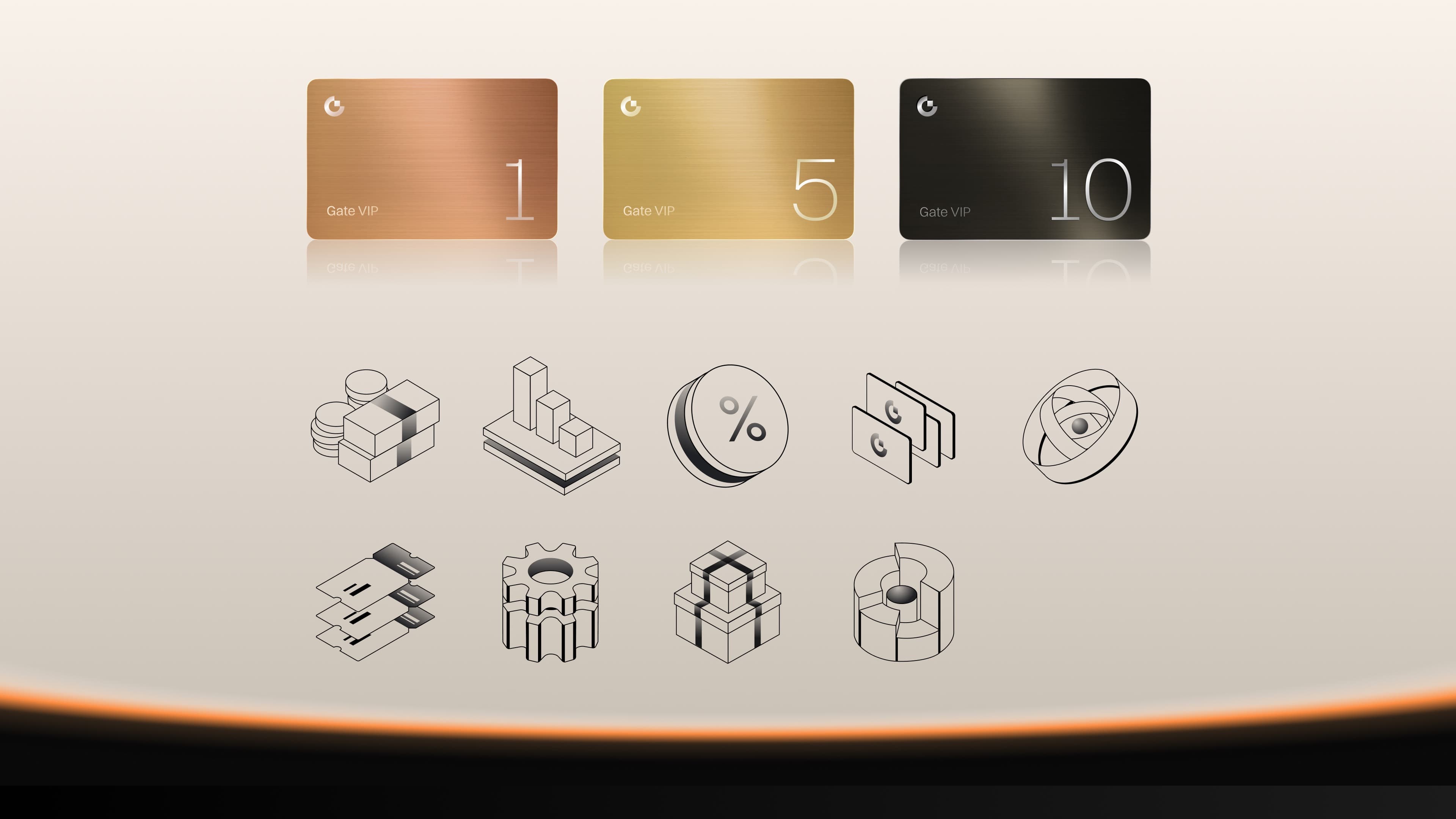
The golden key became the core symbol, representing the Gate to wealth and privilege. Different key materials and forms distinguished tier identities. Noble identity elements were used to express trading information with ceremony, while the black-gold palette emphasized mystery, power, and scarcity.
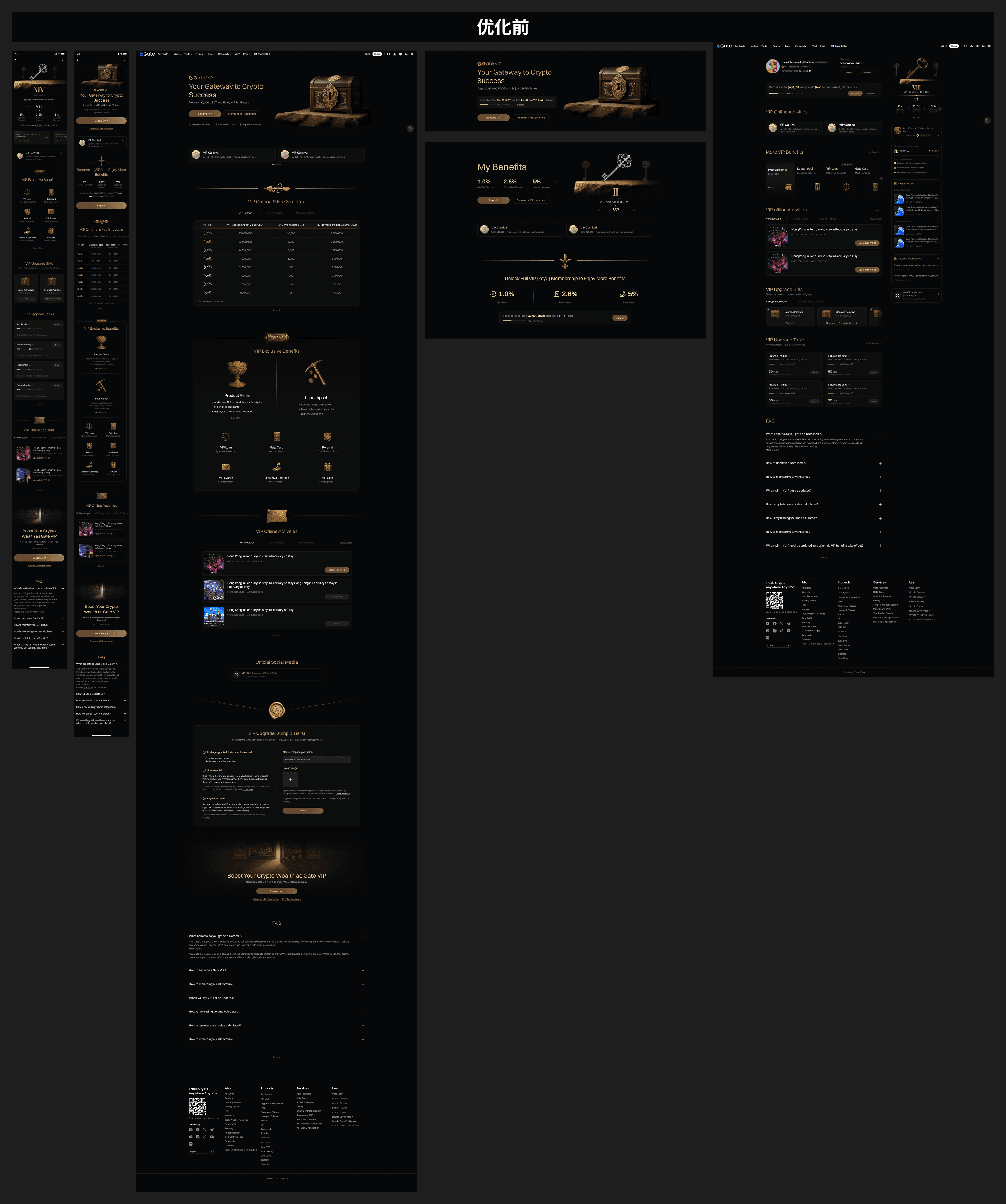
Redesign 5.2
The first iteration successfully established a premium VIP tone, but after launch across platforms, business and user feedback revealed new issues. The dark style could feel heavy on some devices, the decorative retro elements increased cognitive load, and high-tier identifiers such as VIP keys and fee labels lacked color consistency. The overall interface needed more freshness and business clarity for a modern financial platform.

Design Strategy
Based on these findings, the second redesign focused on blending premium quality with modern clarity. Heavy decoration was reduced, and the interface adopted a more international principle of subtractive information design and structured visual presentation, returning attention to function and data.
Execution Details
Restrained color and brighter material quality: the overall UI palette was lifted across headings, buttons, and imagery, while large areas of gold were reduced. Premium neutrals became the foundation, with high-quality gold retained only for scarce key elements.
Information reconstruction and efficiency: redundant decoration was removed, high-density header information was reorganized, and tier labels and fee expressions were unified through stricter grid and structure.
Brand differentiation: the visual language built a stronger connection with Gate while separating the VIP system from mass-market competitors such as Robinhood through color, layout, and a more restrained premium identity.